People love visuals. It’s been estimated that since 2007 visuals taken off the Internet and included in presentations has increased by an overwhelming 9,900 percent.
For a long time, there has been a widespread belief that any presentation audience could be categorized in three Visual, Auditory and Kinesthetic (VAK) or Visual, Aural, Read/Write and Kinesthetic (VARK) categories depending on the learning style that better suits the individual. That kind of analysis has been widely criticized, so I will not throw a lot of statistics at you about it.
However, in the data-overload age, we need an easier way to digest the massive amount of information we receive. In my opinion, infographics are a captivating, quick, fun and informative way to get to the point of a subject across to anyone. Of course this is not new to human beings. Graphical display of information is inherent to us. Let’s face it, we like pretty pictures and 70 percent of our sensorial receptors are in the eyes.
Wikipedia states that the earliest known infographics dates back to 1626 when Christoph Scheiner published the Rosa Ursina sive Sol. The book revealed his research about the rotation of the sun. It contained infographics featuring illustrations that demonstrated the sun’s rotation patterns. If you ask me, I believe cave paintings showing a hunting expedition can be considered an infographic.
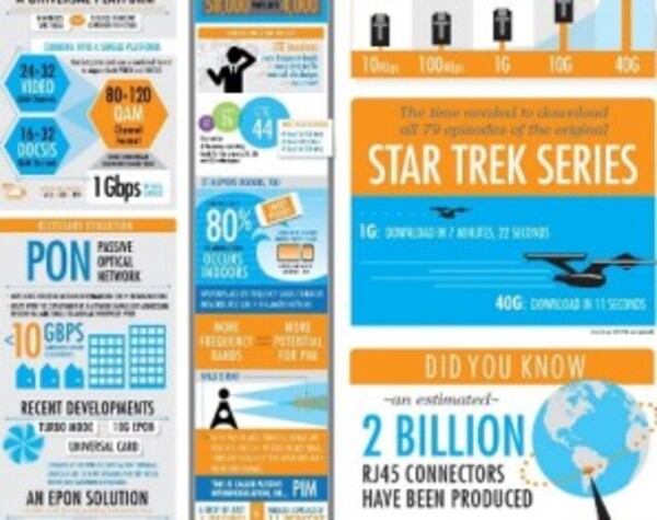
A couple of years back, our Corporate Communications and Creative Services teams had the initiative to use infographics to communicate with engineers illustrating what technology can do for them. Many departments, from marketing to product managers, collaborated to put together interesting information in an intuitive way to tell the story—to generate quick visual reads. The creative minds behind the scenes took data and information and created visual assets that have been well received.
Do you want to learn about in-building wireless in a minute? Are you intrigued by why PIM happens indoors? Have you ever wondered how the broadband networks have evolved? Do you think that RJ45 connector was old fashioned? If your answers to those questions were yes, then I encourage you to check out our infographics page. More are on the way.
By the way, my actual all-time favorite infographic is the Pioneer Plaque, no words at all.


